Designing for Impatient People, and Why That's a Good Thing
 A visitor arrives with the calm focus of a squirrel holding espresso and a mortgage application.
Modern web users do not browse so much as interrogate. They land on a page wanting one thing: the answer. Maybe they need your pricing, your opening hours, your refund policy, or proof that your software does not require a ceremonial chant to install. If the answer hides behind vague menus, slow pages, or heroic paragraphs about brand passion, they leave.
Impatience Is Information
Impatient users are not broken users. They are honest users. Their behavior tells designers where the friction lives. When someone scans instead of reading, that is not a moral failure. It is a design signal.People now move through websites with habits shaped by search engines, social feeds, messaging apps, and instant delivery tracking. They expect structure. They expect clues. They expect the important thing to appear before their thumb starts filing a complaint.
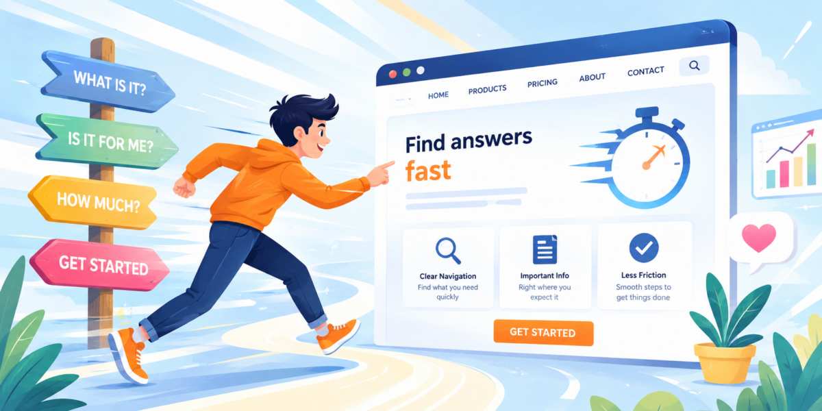
This is why good web design treats impatience as a useful constraint. A page should answer the obvious questions quickly: What is this? Is it for me? What can I do next? What does it cost? Why should I trust it?
Navigation Should Not Require Archaeology
Navigation is not the place to be mysterious. Labels like "Solutions," "Experience," and "Journey" can work, but only when supported by plain choices. If users need to guess what a menu item means, the menu is doing interpretive dance at the worst possible moment.Clear navigation reduces anxiety. It helps users build a mental map of the site. The best menus feel almost boring because boring is sometimes just another word for usable.
A strong navigation system usually includes simple labels, a visible search option when content is deep, and a clear route back to key pages. Dropdowns should help people move faster, not trap them in a tiny hover-based obstacle course designed by a mischievous raccoon.
- Use familiar labels before clever ones.
- Keep top-level choices limited and meaningful.
- Make calls to action visible without making them shout.
Page Structure Follows Attention
Most visitors do not consume a page from top to bottom. They skim, jump, pause, and scan again. Eye-tracking studies have repeatedly shown that users search for visual anchors before committing to deeper reading. Effective page structure acknowledges this reality rather than fighting it.Headings should communicate value immediately. Subheadings should explain what follows. Important information belongs near the top, where it can be discovered quickly. If the answer to a common question is buried halfway down a page, many visitors will never reach it.
This does not mean every page must become a collection of short snippets. Detailed content still matters. The difference is that readers should be able to understand the overall message before deciding whether to invest more attention.
A well-structured page creates multiple entry points. Someone who reads every word should find depth and detail. Someone who scans for fifteen seconds should still leave with the key information.
Content Placement Is a Business Decision
Where information appears on a page can influence whether a visitor stays, converts, or disappears forever into the digital wilderness.Critical details should not be treated like hidden treasure. Pricing, contact information, delivery policies, product specifications, and service descriptions often belong in highly visible locations. Visitors should not need three menu clicks and a burst of determination to discover basic facts.
Many organizations unintentionally prioritize what they want to say over what users want to know. A company may open with a lengthy statement about its vision while visitors are quietly wondering whether the service is available in their city.
Designers who understand impatient behavior learn to rank information according to user needs. The most requested information gets the most prominent placement. Everything else supports that goal.
Some pages improve dramatically after a simple question is asked: "What is the first thing most visitors came here to find?" The answer often belongs closer to the top than anyone expected.
Reducing Friction Creates Momentum
Every extra step introduces risk. Each form field, confirmation screen, account requirement, and unnecessary decision gives users another opportunity to leave.Reducing friction is not about removing every process. It is about removing unnecessary process. If a task requires five steps, there should be a reason for all five. Too often, websites accumulate complexity over time because features are added without examining their effect on the overall experience.
Small improvements can have a surprisingly large impact.
- Faster page loading reduces abandonment.
- Shorter forms increase completion rates.
- Clear instructions reduce confusion.
- Visible next steps encourage action.
Fast Answers Win the Race
Designing for impatient people is ultimately about respecting time. Visitors arrive with goals, questions, and limited attention. A site that helps them reach those goals quickly feels efficient, trustworthy, and easy to use.Ironically, the fastest path to deeper engagement is often making information easier to access. When users find answers quickly, they are more willing to continue exploring. When they encounter obstacles, they start looking for the back button as if it were an emergency exit.
The most effective websites do not demand patience as an admission fee. They recognize how people actually behave and design accordingly. By improving navigation, strengthening page structure, placing content where it matters most, and eliminating unnecessary friction, designers create experiences that feel effortless.
In a world where attention can travel from curiosity to distraction in seconds, helping people find what they need quickly is not lowering standards. It is raising them at full speed.
No Time Like Browse Time
The lesson is surprisingly simple. Users who want immediate answers are not obstacles standing in the way of thoughtful design. They are revealing what thoughtful design should focus on in the first place.A website that respects urgency often becomes easier for everyone. New visitors find their footing faster. Returning visitors accomplish tasks more efficiently. Businesses benefit from fewer abandoned journeys and more completed actions.
Good design does not ask people to slow down. It clears the road ahead, removes unnecessary speed bumps, and lets them reach their destination before another browser tab starts whispering attractive alternatives.
Article kindly provided by nulamedia.co.uk
Latest Articles
- Designing for Impatient People, and Why That's a Good Thing
- Borrowing Film Planning Techniques for Better Graphic and Web Design
- Designing with Light Instead of Filters: How Atmosphere Shapes a Photograph
- The Scent Wardrobe Principle: Designing Your Fragrance Collection Like an Interior Space
- How Small Visual Details Change the Entire Mood of an Image
- Turning Everyday Lighting Into a Design Feature
- Designing Photo Albums That People Actually Revisit
- Designing Illusions: How Sliding Wardrobe Doors Can Visually Reshape a Room
- Fit Over Fashion Why Tailoring Matters More Than Trends for Formalwear
- Why Fast Websites Matter More Than Beautiful Ones When People Are Choosing Where to Eat
- When Product Photos Quietly Sabotage Online Sales
- When a Wedding Day Quietly Becomes Its Own Photographer
- Why Gilded Elements in Art Still Resonate Today
- Why Your Product Photos Should Tell a Story
- Crafting Interiors That Help Music Truly Come Alive
- Why Packaging Design Matters Even for Digital Products
- Color Palettes That Evolve: Creating Schemes That Shift With Time of Day, Mood, or User Context
- Exploring Subtle Details Found in Quality Swiss Timepieces
- How Adaptive Cabin Environments Let Chauffeured Executives Shift Effortlessly Between Rest and Focus
- Jewellery as Identity Encryption: Choosing Symbols That Speak Only to You
- Architecture
- Graphic Design
- Web Design
- Industrial Design
- Interior Design
- Fashion Design
- Photography
- Product Design
- UI/UX Design
- Landscape Design
- Animation
- Industrial Engineering
- Packaging Design
- Branding and Identity Design
- Exhibit Design
- Advertising Design
- Typography
- Motion Graphics
- Sustainable Design
- User Research
- Fashion Merchandising
- Film and Video Production
- UX Writing
- Environmental Design
- Print Design
- Interaction Design
- Art Direction
- Textile Design
- Game Design
- Virtual Reality (VR) Design
- General Design Principles
- Event and Wedding Design